Rightsizing - show, don't tell
Hello reader. My employer has been in rightsizing mode lately, and I've participating more in that exercise than ever before. As you probably know I'm a data person, and I believe very strongly that the practice of FinOps is a data-heavy practice. I'm continually learning new tricks and lately I'm getting around to the "story telling" portion of a well-rounded data practice. Let me illustrate...
Opportunity knocks
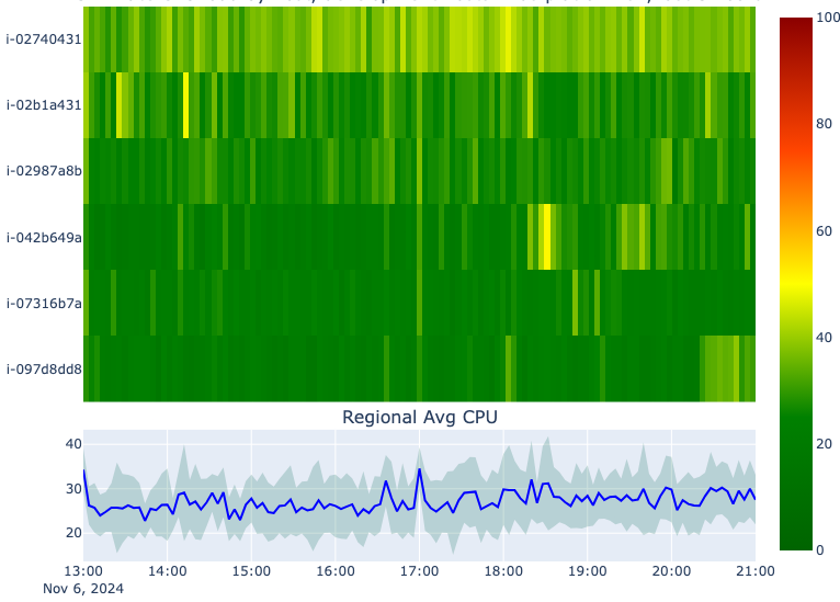
Not terribly long ago we launched a new product feature that allowed us to target development resources that hadn't been used in a few weeks and "power them down" on behalf of our customers. They could power them back up as needed of course, but this had the overall effect of reducing compute usage across a certain tier of our VMs by about 30%.
The chart above shows total CPU time allocated by our container orchestration framework. The underlying VMs are still there, just working that much less. In theory we can remove that much compute capacity from our system, but here's where things get complicated.
At that exact point in time, we were launching a major new product line. The entire engineering org was tied up in shipping this new product line, and this new product line also came with some interesting (and still in flux) changes to the compute profiles that we'd be selling. Nobody had the bandwidth to contemplate what all these competing priorities meant for each other, so we just focused on the hard deliverable and decided to leave this for later. Time goes by...
New product line gets launched, life stuff happens, nobody's fully "in charge" of this capacity planning routine, and the optimization that we made last year also more or less broke our old (clearly not mission critical) reporting. Boss gives me an assignment to rebuild this reporting, what we colloquially refer to as "the overcommit reporting", so that we can start to trim the fat in the system.
to the data..
Our previous iteration of the overcommit reporting gave us the ratio of sold/allocated capacity to actual capacity. Without going into all the details, this ratio is very important for both profitability and the experience of our customers on our platform. We've always taken an approach informed by experience but not necessarily by hard data, and so I've had a hunch that our understanding of this topic wasn't as well developed as it should be.
After some experimentation it occurred to me that the ratio we'd been watching all these years was more of an output metric - it's the outcome we want to watch. The input metric should be something closer to the customer experience - at what point does overcommitting a VM start to noticeably affect performance of our customers' applications? This is one of those topics that sounds really obvious but from my experience, the process of building up the data ecosystem and literacy within an existing company is anything but obvious. This was the real job.
Let's get our hands on the VM usage and utilization data and understanding loading of our platform regions around the world.
Well, as FinOps practitioners, and for as much as we talk about "rightsizing" as being one of the core activities, it's amazingly difficult to get your hands on the proper usage data. Take AWS. The service at play is Cloudwatch. It's not free, and the UI is pretty Byzantine (to me). I have tried to query for all machines of type $whatever in a given region and this is what they give you.

This assumes that you even have access in the first place, which you might not. Also, if you're a multi-cloud shop you already know the pain of learning multiple billing consoles. The pain of learning multiple cloud vendor metrics consoles is equivalent.
I'm very lucky to work in a shop that collects our own cloud-agnostic resource metrics in a central location - BigQuery. Over a couple days I built out a POC of a system-wide infrastructure monitoring setup in Metabase, our BI tool.
💡 One nice thing about SQL in general is the ability to define custom metrics over arbitrary slices of our infrastructure. I start playing with a metric that I call the "heat index" that's essentially a function of the average CPU load across several machines + the Std Dev of CPU load across those same machines. This gives me an idea of how heavily loaded the machines are on average, but also the spread between hottest and coolest machine. A wider spread indicates an unbalanced load.
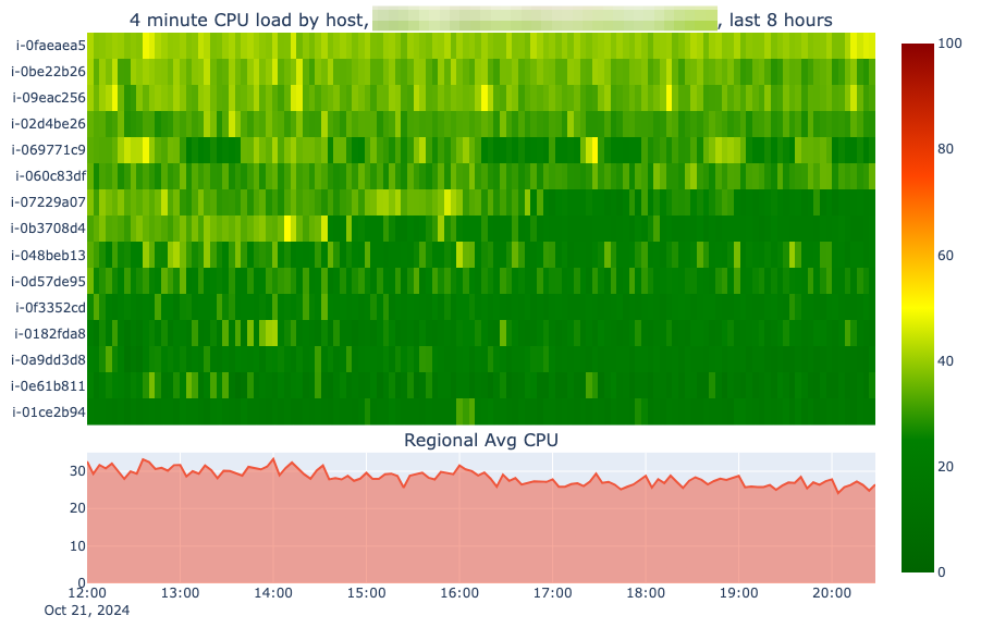
So one weekend I search "dense time series visualization" and lo and behold, I discover the door to a whole new level of data analysis. I get started on Monday and within a few hours I have a working prototype of a "heatmap" visualization. Let's compare two visualizations of the exact same data. First is a line chart of CPU utilization over 15 hosts worth of data.
So I'm pretty sure this tells me that the region is happy, but I'm not sure how this tells me whether we have too many machines in the region. It looks like the average is between 20% and 40% utilization, the max on the Y axis is 45%. There's a spike up to 50% for one machine for a minute but this does not tell me a story. It most certainly does not tell our engineering and operational staff a story. Let's look at this data another way and see if we get somewhere.
So I shared this with my coworkers in the infrastructure team and within a very short amount of time, we'd begun the plan to reduce some of this capacity where the chart above shows we clearly have some extra to spare. This heatmap viz gives each VM its own row, and I have the ability to manually set the scale between 0% and 100% utilization. Every line chart out there is going to default to setting the scale between min% and max%, which our human brains just don't interpret as cleanly as this heatmap above.
Now, if I may, this is how you FinOps. You don't go to your operational teams and talk about "rightsizing" and why it's important. From their point of view the system is functional which means the customers are happy and they are not getting yelled at and they are not at all wrong. Most infrastructure observability tools are open source, off-the-shelf and setup by operational staff with a few extra hours. They rarely have the time to keep going after they solve their first set of problems, which is how our observability sat for some years.
In chart number 2 though, it's quite clear that we have excess capacity and we can safely shed a few machines. Take them this and everyone can see in an instant that in some places we have an excess of capacity.
The wrap
The more I do it, the more I'm convinced that FinOps is a very specialized, very important BI and Data Science role. The more data access you have as a practitioner, and the more you understand the underlying data terrain in terms of cloud infrastructure, and the more skill you have with extracting insights from all that data, the more you can be useful to your engineering teams. I have other charts that allow us to visualize utilization across the entire fleet, 18 regions worth of 6-8 different machines types, with 3-24 machines of each type. Hotspots - and excess capacity - have never been this easy to spot.
The end result of this work is going to be a relatively tremendous amount of cloud savings, because we can see more clearly.
Get your hands dirty.


